Brand Identity & Design System

Purchase
$38
2
Version 2.0
Last updated: 27/08/25

Identity

Who are we, what is the why behind why do we do what we do ( building others wealth )

Core Values

Quilter Invest's core values

Empowerment

Break down barriers to financial knowhow

Simplicity

We make it easy and keep it simple

Trustworthy

We only tell the facts. You can trust us

Nuture

Guide people to build wealth.

Insightful

Be insightful for our users

Different

We provide a differnt persective on things

Our Name

Quilter Invest
Default
quilterinvest.com
Default domain

Our Mission & Purpose

At Quilter Invest, our mission is to empower individuals to achieve financial success and build lasting wealth. We provide innovative investment solutions and smart saving strategies that enable our customers to navigate their financial journeys with confidence

Our Quilter Invest Brand Story

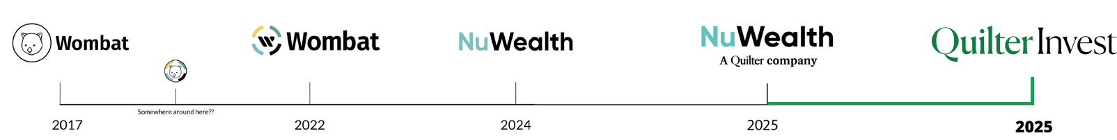
We started as a small investing app, but now we are excited to announce our rebranding to Quilter Invest. This transition marks a significant milestone in our growth journey, reflecting our evolution and maturity as a company. With the introduction of new saving account types, we have expanded our offerings to better serve our customers and meet their diverse financial needs.

At Quilter Invest, we believe investing should be clear, accessible and empowering. It is not a secret club or a second job. It is a way to take control of your financial future with the right tools and the right support.

Built on the experience and security of Quilter, one of the UK’s most trusted wealth management firms, Quilter Invest brings that expertise into a modern digital platform. It is designed for a new generation of investors, from first time savers and career builders to confident planners preparing for the future.

Our goal is to remove barriers and reduce complexity. No jargon, no unnecessary pressure. Just intuitive tools, transparent pricing and expert built portfolios. Whether you are starting with £10, saving for a long term goal, or preparing for retirement, we provide the clarity and guidance to help you move forward with confidence.

This is not only about portfolios or performance. It is about building a future you believe in, supported by a partner you can trust.
Welcome to Quilter Invest. Clear, modern investing on your terms.

Tone of voice

Who are we, what is the why behind why do we do what we do ( building others wealth )

Tone of Voice

Our Tone Is:

Clear

No jargon. Just straight-up, easy-to-understand language.

Confident

We speak with the authority of Quilter, without sounding corporate.

Human

We talk like real people — calm, helpful, and down-to-earth.

Modern

Designed for today’s users. Shorter sentences, natural tone, light when appropriate.

Example Applications:
Onboarding screen: > “We’ll help you grow your money let’s get started.”
CRM nudge: > “Your money’s just sitting there. Let’s put it to work.”
Help/Support:> “We’re here if you get stuck just drop us a message.”

Do’s:

Use contractions (We’ll, You’re, It’s)
Explain before you persuade
Focus on clarity over cleverness

Don’ts:

Don’t use technical jargon unless explained
Don’t be overly salesy or pushy
Don’t write like a bank brochure

Logos

All colour options and files are stored on our google drive. Looking for A logo that has a specific size?
Request a logo
See other formats

Primary Logo

Quilter Invest full logo
Quilter Invest Short form logo

Logo Variants

Approved Colours. Bellow you will find all the logos in all format types. | Logo do's & don'ts
Request a logo
Jepgs have a background and are normally lighter file size to PNG or GIfs
Wombat invest colour logo
Long-form Logo - Light
Primary & Black
JPEG - On White #ffffff
Wombat invest colour logo
Short form Logo - Light
Primary & Black
JPEG - On White #ffffff
Wombat invest colour icon logo
Icon - Light
Primary & Black
JPEG - On White #ffffff
Wombat invest colour icon logo
Long-form Logo - Dark
Green highlight & White
JPEG - On Black #232323
Wombat invest colour logo
Short form Logo - Dark
Green highlight & White
JPEG - On Black #232323
Wombat invest colour icon logo
Icon - Dark
Green highlight & White
JPEG - On Black #232323
Wombat invest colour icon logo
Long-form Logo - Monotone
White
JPEG - On Primary #0e7b40
Wombat invest colour logo
Short form Logo - Monotone
White
JPEG - On Primary #0e7b40
Wombat invest colour icon logo
Icon - Monotone
White
JPEG - On Primary #0e7b40
Wombat invest colour icon logo
Long-form Logo - Monotone
Black
JPEG - On Secondary #fbcd2d
Wombat invest colour logo
Short form Logo - Monotone
Black
JPEG - On Secondary #fbcd2d
Wombat invest colour icon logo
Icon - Monotone
Black
JPEG - On Secondary #fbcd2d
Wombat invest colour icon logo
Long-form Logo - Monotone
Primary
JPEG - On White #ffffff
Wombat invest colour logo
Short form Logo - Monotone
Primary
JPEG - On White #ffffff
Wombat invest colour icon logo
Icon - Monotone
Primary
JPEG - On White #ffffff
Wombat invest colour icon logo
Long-form Logo - Monotone
White
JPEG - On Black #232323
Wombat invest colour logo
Short form Logo - Monotone
White
JPEG - On Black #232323
Wombat invest colour icon logo
Icon - Monotone
BlacWhitek
JPEG - On Black #232323
Wombat invest colour icon logo
Long-form Logo - Alternative
White & Black
JPEG - On Primary #0e7b40
Wombat invest colour logo
Short form Logo - Alternative
White & Black
JPEG - On Primary #0e7b40
Wombat invest colour icon logo
Icon - Alternative
White & Black
JPEG - On Primary #0e7b40
PNG's are used for images with transparency. All of the bellow don't have a-background on them. (bg i for display purposes)
Wombat invest colour logo
Long-form Logo - Light
Primary & Black
PNG - On White #ffffff
Wombat invest colour logo
Stacked Logo - Light
Primary & Black
PNG - On White #ffffff
Wombat invest colour icon logo
Icon - Light
Primary & Black
PNG - On White #ffffff
Wombat invest colour icon logo
Long-form Logo - Dark
Green highlight & White
PNG - On Black #232323
Wombat invest colour logo
Short form Logo - Dark
Green highlight & White
PNG - On Black #232323
Wombat invest colour icon logo
Icon - Dark
Green highlight & White
PNG - On Black #232323
Wombat invest colour icon logo
Long-form Logo - Monotone
White
PNG - On Primary #0e7b40
Wombat invest colour logo
Short form Logo - Monotone
White
PNG - On Primary #0e7b40
Wombat invest colour icon logo
Icon - Monotone
White
PNG - On Primary #0e7b40
Wombat invest colour icon logo
Long-form Logo - Monotone
Black
PNG - On Secondary #fbcd2d
Wombat invest colour logo
Short form Logo - Monotone
Black
PNG - On Secondary #fbcd2d
Wombat invest colour icon logo
Icon - Monotone
Black
PNG - On Secondary #fbcd2d
Wombat invest colour icon logo
Long-form Logo - Monotone
Primary
PNG - On White #ffffff
Wombat invest colour logo
Short form Logo  - Monotone
Primary
PNG - On White #ffffff
Wombat invest colour icon logo
Icon - Monotone
Primary
PNG - On White #ffffff
Wombat invest colour icon logo
Long-form Logo - Monotone
White
PNG - On Black #232323
Wombat invest colour logo
Short form Logo - Monotone
White
PNG -  On Black #232323
Wombat invest colour icon logo
Icon - Monotone
BlacWhitek
PNG - On Black #232323
Wombat invest colour icon logo
Long-form Logo - Alternative
White & Black
PNG - On Primary #0e7b40
Wombat invest colour logo
Short form Logo - Alternative
White & Black
PNG - On Primary #0e7b40
Wombat invest colour icon logo
Icon - Alternative
White & Black
PNG - On Primary #0e7b40
Download SVG
Wombat invest colour logo
Long-form Logo - Light
Primary & Black
SVG - On White #ffffff
Wombat invest colour logo
Short form Logo - Light
Primary & Black
SVG - On White #ffffff
Wombat invest colour icon logo
Icon - Light
Primary & Black
SVG - On White #ffffff
Wombat invest colour icon logo
Long-form Logo - Dark
Green highlight & White
SVG - On Black #232323
Wombat invest colour logo
Short form Logo - Dark
Green highlight & White
SVG - On Black #232323
Wombat invest colour icon logo
Icon - Dark
Green highlight & White
SVG - On Black #232323
Wombat invest colour icon logo
Long-form Logo - Monotone
White
SVG - On Primary #0e7b40
Wombat invest colour logo
Short form Logo - Monotone
White
SVG - On Primary #0e7b40
Wombat invest colour icon logo
Icon - Monotone
White
SVG - On Primary #0e7b40
Wombat invest colour icon logo
Long-form Logo - Monotone
Black
SVG - On Secondary #fbcd2d
Wombat invest colour logo
Short form Logo - Monotone
Black
SVG - On Secondary #fbcd2d
Wombat invest colour icon logo
Icon - Monotone
Black
SVG - On Secondary #fbcd2d
Wombat invest colour icon logo
Long-form Logo - Monotone
Primary
SVG - On White #ffffff
Wombat invest colour logo
Short form Logo - Monotone
Primary
SVG - On White #ffffff
Wombat invest colour icon logo
Icon - Monotone
Primary
SVG - On White #ffffff
Wombat invest colour icon logo
Long-form Logo - Monotone
White
SVG - On Black #232323
Wombat invest colour logo
Short form Logo - Monotone
White
SVG - On Black #232323
Wombat invest colour icon logo
Icon - Monotone
BlacWhitek
SVG - On Black #232323
Wombat invest colour icon logo
Long-form Logo - Alternative
White & Black
SVG - On Primary #0e7b40
Wombat invest colour logo
Short form Logo - Alternative
White & Black
SVG - On Primary #0e7b40
Wombat invest colour icon logo
Icon - Alternative
White & Black
SVG - On Primary #0e7b40

Colour Palette

Primary Palette

Fill Colours
Qi yellow
#fbcd2d
Quilter light green
#169f50
Dark green
#005522
Quilter green
#0f7b3f
Quilter mid green
#159847
Highlight green
#24a94d
Grey Colours
Dark grey
#232323
Grey 1
#636363
Grey 2
#f2f2f2
Grey 3
#f8f8f8
Grey 4
#f8f8f8
White
#ffffff

Background colours

For use only with backgrounds
Primary text
#232323
Secondary
#636363
Anti-Flash white
#f2f2f2
Regent Gray
#f8f8f8
Alt light grey
#FAFAFA
White
#ffffff

Typography Styles

Lato

Font family - Available free on google fonts website

Bold

Regular

Hierarchy

This is how we show the importance of titles against body text.

Aa Bb Cc Dd Ee

Heading 1 - Bold
Kern: Default | Leading: Auto | Tracking: Auto

Aa Bb Cc Dd Ee

Heading 2 - Bold
Kern: Default | Leading: Auto | Tracking: Auto

Aa Bb Cc Dd Ee

Heading 3
Kern: Default | Leading: Auto | Tracking: Auto

Aa Bb Cc Dd Ee

Heading 4
Kern: Default | Leading: Auto | Tracking: Auto
Aa Bb Cc Dd Ee
Heading 5
Kern: Default | Leading: Auto | Tracking: Auto
Aa Bb Cc Dd Ee
Heading 6
Kern: Default | Leading: Auto | Tracking: Auto
Download font files

Body Copy

Typography - Inter

Lorem Ipsum has been the industry's standard dummy text ever since the 1500s, when an unknown printer took a galley of  type and scrambled it to make a type specimen book.

Paragraph Large
Kern: Default | Leading: | Tracking:

Lorem Ipsum is simply dummy text of the printing and typesetting industry. Lorem Ipsum has been the industry's standard dummy text ever since the 1500s, when an unknown printer took a galley of  type and scrambled it to make a type specimen book.

Paragraph Normal
Kern: Default | Leading: | Tracking:

Lorem Ipsum is simply dummy text of the printing and typesetting industry. Lorem Ipsum has been the industry's standard dummy text ever since the 1500s, when an unknown printer took a galley of  type and scrambled it to make a type specimen book.

Paragraph Small
Kern: Default | Leading: | Tracking:

Lorem Ipsum is simply dummy text of the printing and typesetting industry. Lorem Ipsum has been the industry's standard dummy text ever since the 1500s, when an unknown printer took a galley of  type and scrambled it to make a type specimen book.

Detail Messages

Quotes

Typography - Inter
The ultimate Interface component kit built to create harmony across your products.
Plain Quote Block
Default
The ultimate Interface component kit built to create harmony across your products.
Additional Detail Messages
Secondary

Additional Copy Elements

  • Example Item 1
  • Example Item 2
  • Example Item 3
List Items - Dots
  • Example Item 1
  • Example Item 2
  • Example Item 3
List Items - Numbers
  • Example Item 1
  • Example Item 2
  • Example Item 3
List Items - Letters

Additional Copy Elements

This line rendered as bold text.

Bold Text

This line rendered as italicized text.

Italicized Text

This line of text is meant to be treated as deleted text.

Deleted Text

This line of text is meant to be treated as deleted text.

Underline Text

You can use the mark tag to highlight text.

Highlight Text

You can use the mark tag to highlight text.

ALT Highlight Text

Text Alignments

Left aligned text

Approved

Center aligned text

Approved

Assets & Imagery

Stock imagery

Acceptable Imagery | Imagery do's & don'ts

The correct imagery must be used when downloading or using stock imagery. Here is the file containing the folder of current already downloaded imagery and approved images that have been used in media across the Wombat estate

IMPORTANT!
If using free images, ensure that it uses a GPL licence and there are no rights on the image usage

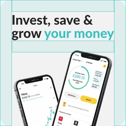
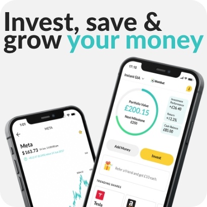
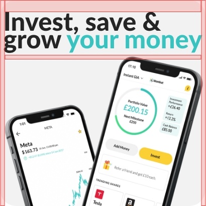
Product Imagery (WIP)

Acceptable Product imagery | Product imagery do's & don'ts

We have some pre-made assets that were created for use in marketing materials and across the Wombat estate

PressKit

Available on request | Request press kit zip

Press kit contains - images and assets approved for use by a third party

Brand Patterns

Patterns and device elements (WIP)

Acceptable Imagery | Imagery do's & don'ts

The correct imagery must be used when downloading or using stock imagery. Here is the file containing the folder of current already downloaded imagery and approved images that have been used in media across the Wombat estate

Icons

Icons

Online directory
Line 8
SVG files
On Gdrive
PNG files
On Gdrive
Download other formats

Pictograms

Online directory
Line 8

Buttons

Primary CTA Buttons

Rounded Button | Button do's & don'ts
Primary
Normal State
Primary
Hover
Disable
Disabled
Secondary
Normal State
Primary
Hover
Disable
Disabled
Teritary
Normal State
Primary
Hover
Disable
Disabled

Elevation & Shadows

Elevation & Shadows

Outer Shadow, Inner Shadow | Shadow do's & don'ts
Shadow
S1
Angle:180
Distance: 2px
Blur: 5px
Size: 0px
Shadow
S2
Angle:180
Distance: 3px
Blur: 5px
Size: 0px
Shadow
S3
Angle:180
Distance: 5px
Blur: 16px
Size: 0px
Shadow
S4
Angle:180
Distance: 20px
Blur: 40px
Size: 0px
Shadow
S5
Angle:180
Distance: 30px
Blur: 60px
Size: 0px
InnerShadow
I1
Angle: 225
Distance: 1px
Blur: 2px
Size: 0px
InnerShadow
I2
Angle: 225
Distance: 1px
Blur: 3px
Size: 0px
InnerShadow
I3
Angle: 225
Distance: 6px
Blur: 8px
Size: 0px

Borders and Radii

Borders

Acceptable borders and widths | Border do's & don'ts

This is the acceptable use of borders in the Wombat brand

No Border
stroke: 0
Approved colours
Solid Line
stroke: 1px
Approved colours
Medium line
stroke: 2
Approved colours
Maximum line
stroke: 4
Approved colours

Corner Radius

Acceptable corner radius | Radius do's & don'ts

Corner radii are applied to all box assets. You should select the correct corner radium from the approved below. Depending on the design you must not use less than the minimum corner radius. We use this so that our corners are not sharp

Min corner radius
4px
Small corner radius
8px
Medium corner radius
16px
Large corner radius
32px
Full corner radius
100px

Backgrounds

Backgrounds & Contrasts

Acceptable Backgrounds | Background do's & don'ts

In the section, you can find all the approved backgrounds that you are approved to use within the Wombat brand

Solid Colour Backgrounds
White
#ffffff
Black
#232323
Dark grey
#636363
Accent Gray
#f8f8f8
Anti-Flash white
#f2f2f2
Primary
#37c4c0
Secondary
#fbcd2d
Gradient Backgrounds

We do not use colour gradients for backgrounds

Asset use in Backgrounds

Acceptable asset usage in backgrounds | Background do's & don'ts

In the section, you can find all the approved way we use assets in backgrounds

Good example
The main points in the design are clear, easy to see, and easy to understand. Minimal focal points.
Bad example
The red indicates that there are too many places to look at. This makes the image hard to view and reduces interest.
Good example
The maximum amount of assets allowed in the background for Wombat designs.
Bad example
This example shows what not to do when it comes to adding assets in the backgrounds.

Spacing & Composition

Spacing

Acceptable Spacing | Spacing do's & don'ts

How and when to use the spacing system in designs. Please note that there will be exceptions to these rules - this is a loose guide on how the design spacing is selected

No personal space

0px

When items need to be very close together

Seldom used

Like a couple

4px

Use this spacing when objects or text need to be associated together and the amounts of text are small and short.

Seldom used

We are close

8px

Use this spacing when objects or text needs to be close but have longer text or if the object is too distracting then use this

Often used

Default padding or margin

16px

This is used mostly in the app. when in doubt about which spacing to use then use this spacing. 16 provides enough space so that text doesn't become congested and becomes effort to read.

Used very often

Need some space

24px

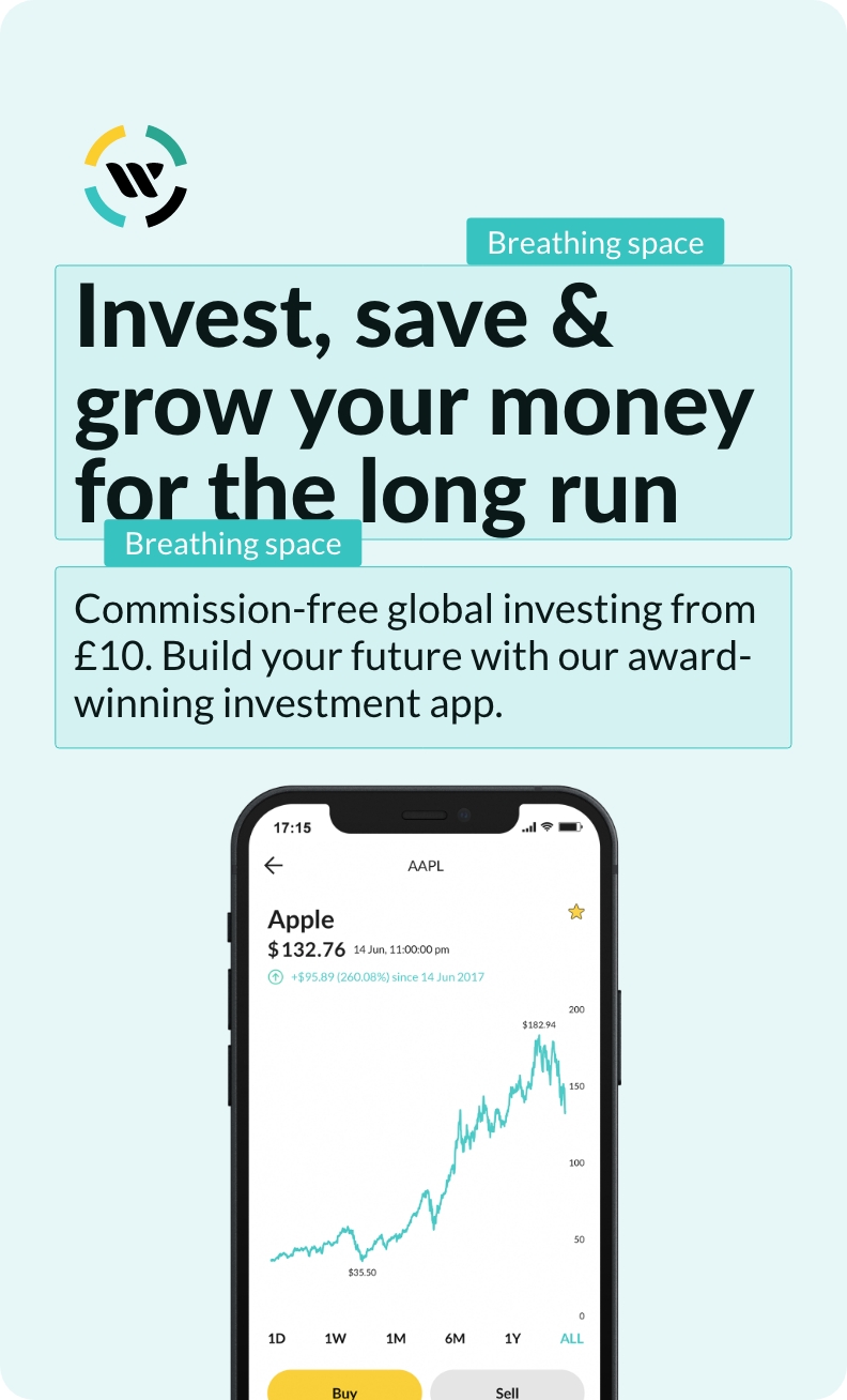
Use this spacing when objects or text need breathing space and there needs to be space between as they are not related or the design is busy and needs more breathing space so as to not cause grouping or clutter.

Used often

Let it breath

32px

Use this spacing when objects or text need breathing space, generally used to separate large blocks of text or if the design is busy and needs more breathing space so as to not cause grouping or clutter

Used often

We were on a break

40px

Use this spacing when to define larger gaps between content with lots of information or clashing imagery.

Seldom used

You said you wanted space

48px

Use this spacing when there is a need for a blank area.

Never used
Good example
Simple, clutter-free design, with good breathing space.
Good example
The green shows the spacing added to the composition between elements.
Bad example
No breathing space or margins. Cheapens the look and feel.
Bad example
The red is showing the poor spacing and lack of margins.

Composition

Acceptable assembling of assets| Assembling do's & don'ts

How we assemble assets

Avoid clutter

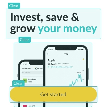
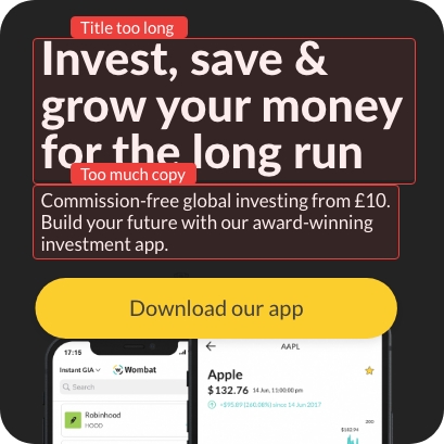
The design needs to remain clear and simple. It should have one main focal point and a secondary point. All Call To Actions must be clear, and easy to understand and identify. The design must remain simple and use no more that two main assets. Avoid placing too many assets in the graphic

Good example
Simple clutter-free design, with good, clear focal points.
Good example
The green shows the areas of interest, that quick and easy to understand.
Bad example
Overuse of icons in backgrounds, bad contrasts,and lots of clutter.
Bad example
The red shows using too many assets is making the areas of interest hard to see.
Good example
This design demonstrates how the use of spacing in the characters, and line spacing, make the design easier to read and digest. More space allows for easier digestion of words, and looks less cluttered.
Bad example
The red shows that Kerning is incorrect, and the character spacing is too close together. This makes the text dense and  intimidates the reader. Allowing the text to breathe lets the reader read more quickly and easily.

Points of Interest

The design needs to remain clear and simple. It should include one main focal point, plus a call to action

Good example
Simple clutter-free design, with a good, clear point of interest.
Good example
The green shows the points of intrest are clear and easy to understand.
Bad example
Copy bloat is bad because it convolutes the key point of the design and makes the design hard to read and digest.
Bad example
The red shows areas of bloated copy, that push the design down, with assets not using the correct spacing.

Avatars

Avatars

TB

X Large
96px

TB

Large
40px

T

Medium
32px

T

Small
24px

T

X Small
18px

Field Elements

Looking for something else? View the glossary

Form Fields

Input Fields WEB ONLY

Field Elements

Input Fields (WEB ONLY)
Intruction text here
Thank you! Your submission has been received!
Oops! Something went wrong while submitting the form.

Alert Bars

Looking for something else? View the glossary

Notification

Input Fields (WEB ONLY)
Looks like we're having trouble
Default Alert Error
Looks like we're having trouble
Warning Alert
Looks like we're having trouble
Error Alert
Your information has been saved.
Default Alert Check
Your information has been saved.
Default Alert Grey
Your information has been saved.
Confirm Alert

Badges

Looking for something else? View the glossary

Pill Badges

Notification markers (WEB ONLY)
5
32
32
32
32
5
32
22
3
3

Contextual Badges

Call out badges
Default
Primary
Success
Warning
Error
Default
Primary
Success
Success
Success

Version Control

1
Version 1.0
1
Version 1.0
1
Version 1.0
1
Version 1.0
1
Version 1.0
1
Version 1.0
1
Version 1.0
1
Version 1.0
1
Version 1.0
1
Version 1.0
WIP

Still to come

Still working on it

Brand Personality

Marketing Organic

Internal process guide

Resource hub

Gated Resources